Editorial Design

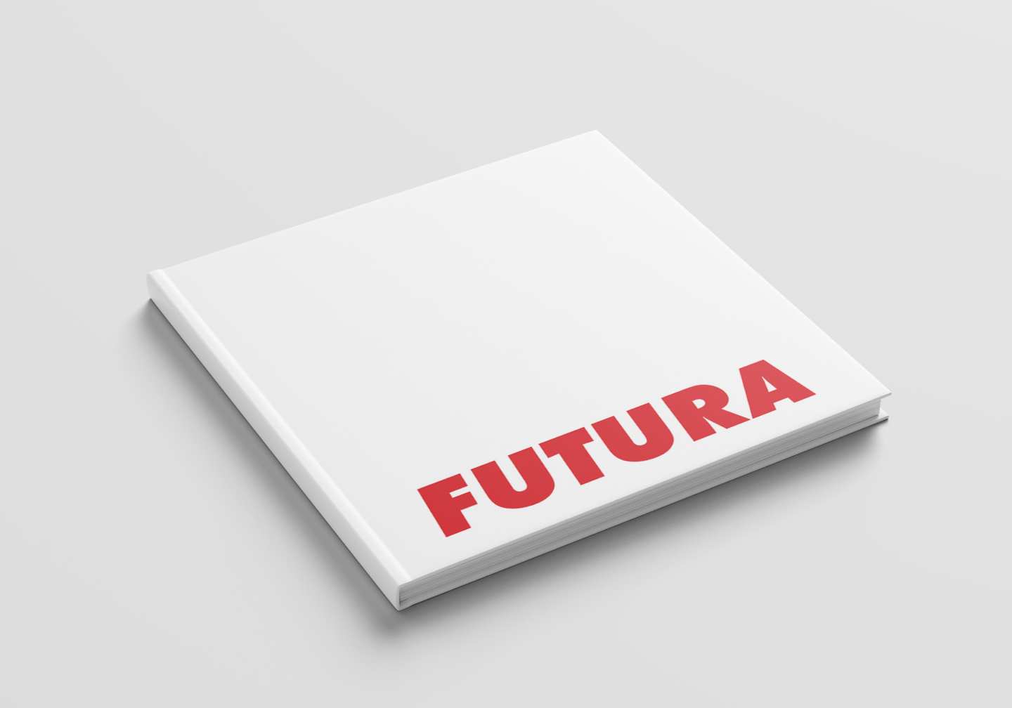
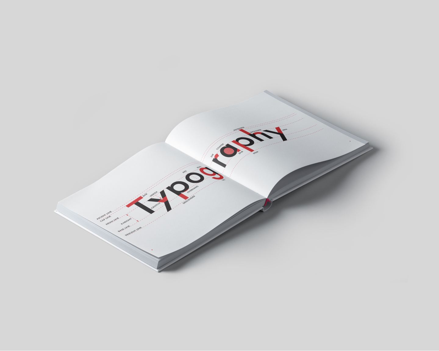
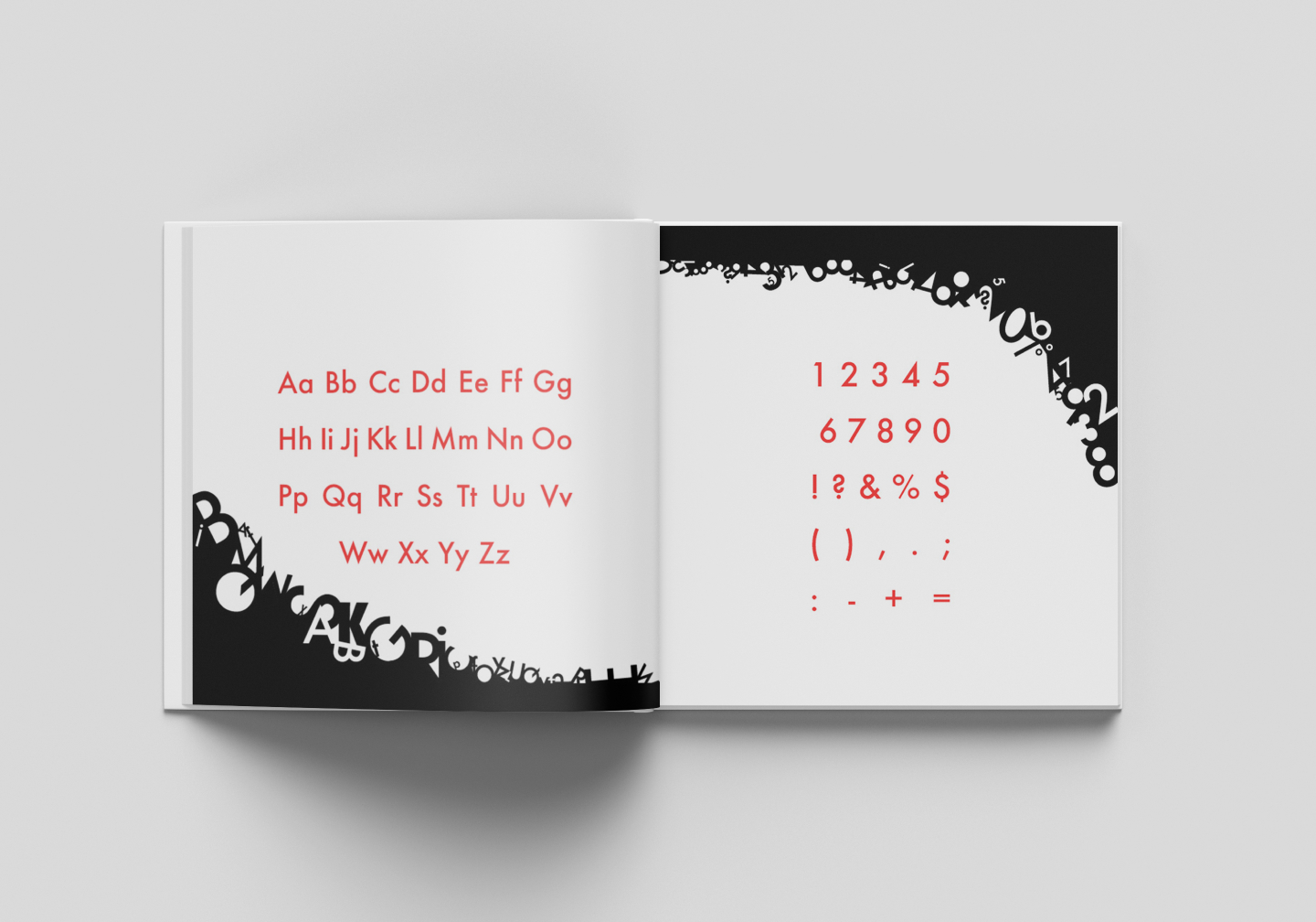
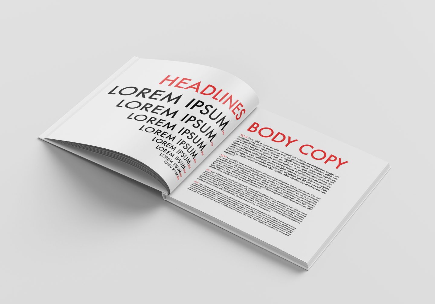
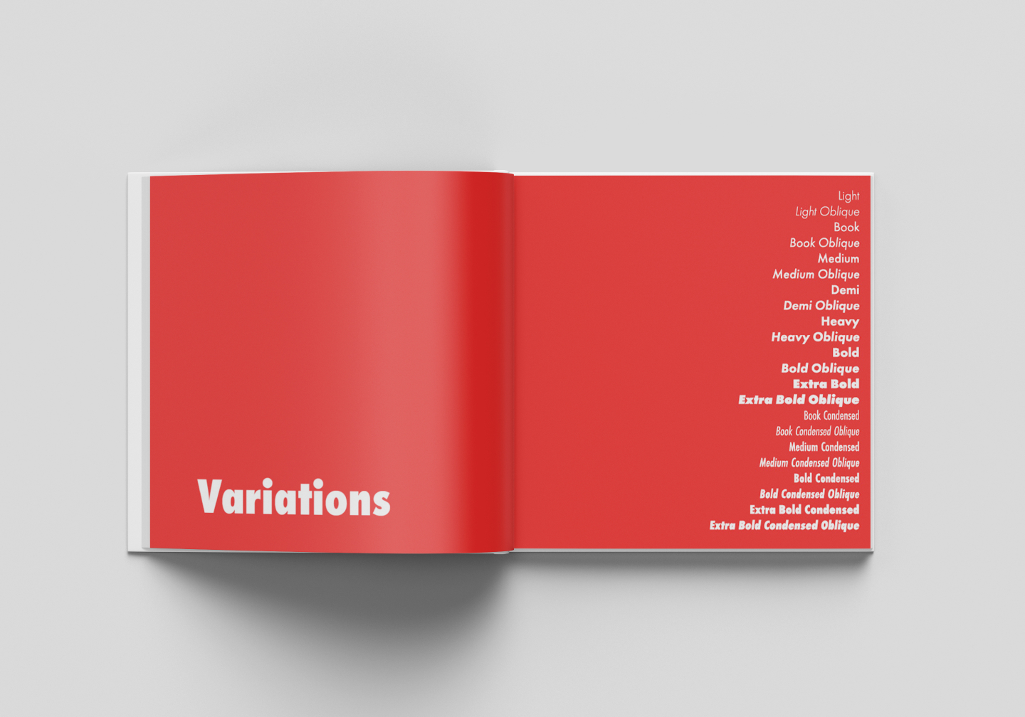
Futura Typographic Study

    Tools Used:

  • Adobe InDesign
  • Adobe Illustrator
  • Adobe Photoshop

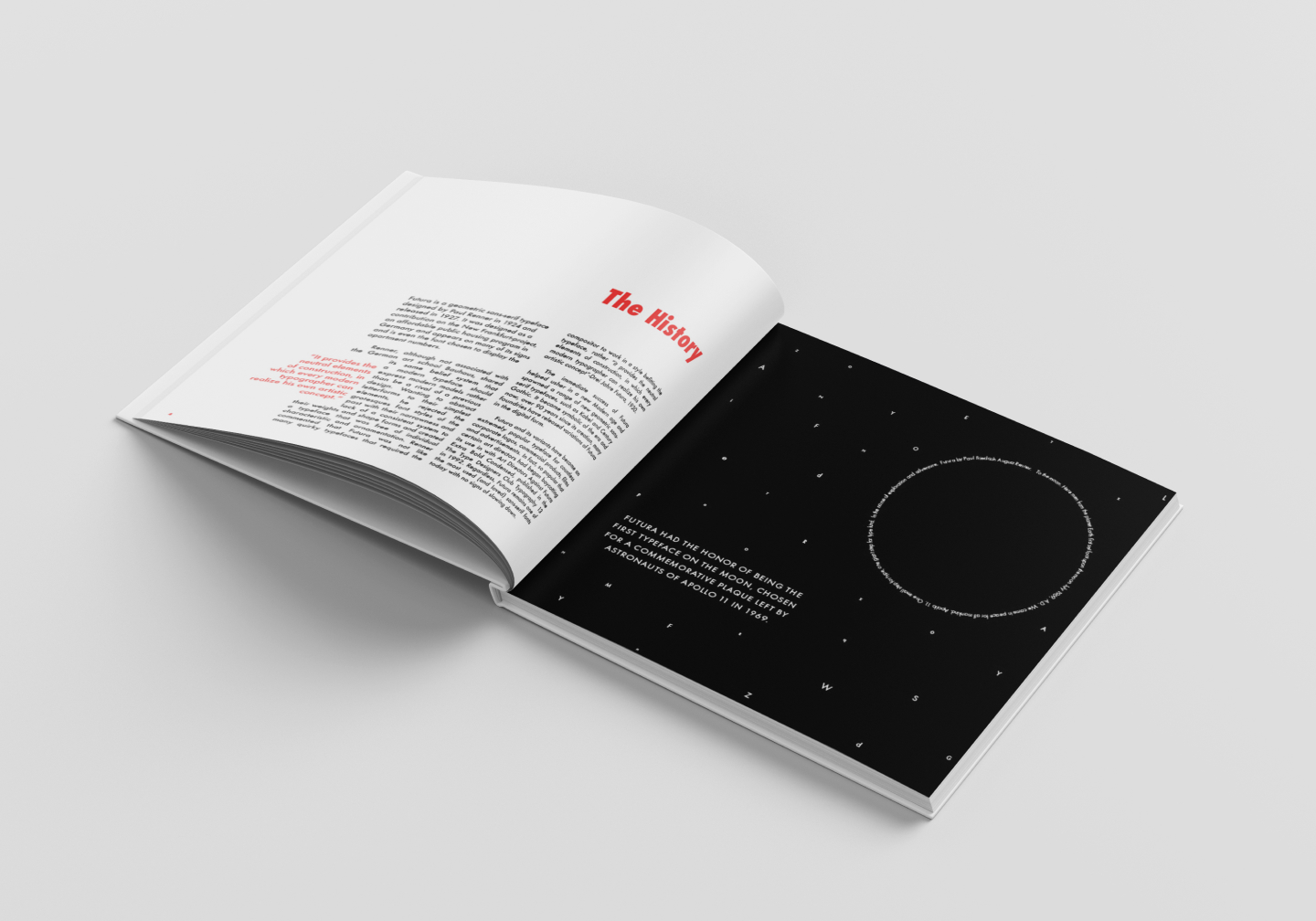
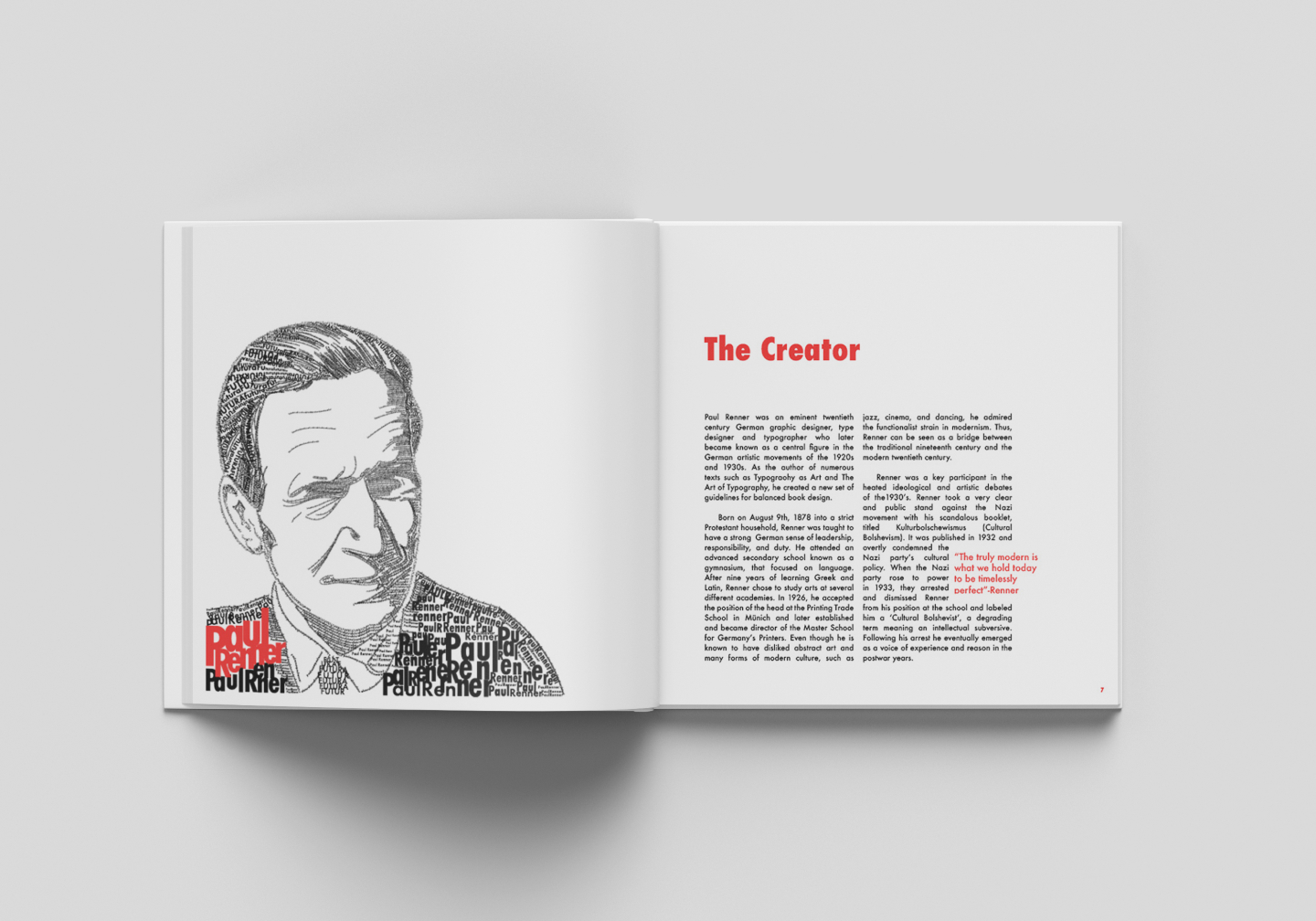
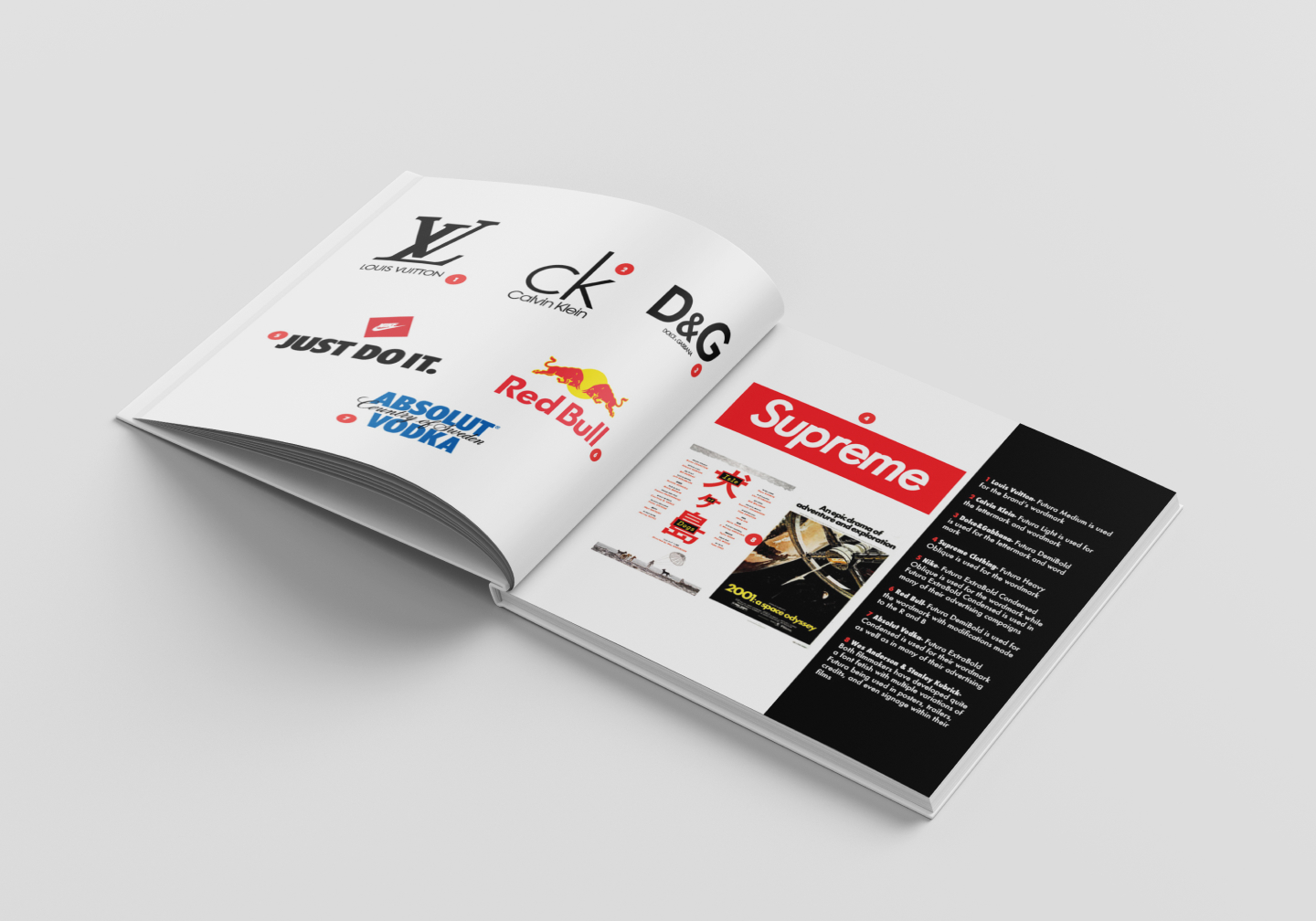
A detailed examination and analysis of the geometric sans-serif typeface designed by Paul Renner. I delved deep into the anatomy, history and creator of the typeface as well as showcased its many variations and famous uses. I kept my color palette simple as to let the typeface shine, using a stimulating and vibrant red to convey my passion for typography.

Cover of a white square book with red letters saying Futura. Done by Stephanie Reid Designs Inside cover of Futura book with table on contents. Main colors are white and red. Done by Stephanie Reid Designs Image of open Futura book. The right page showcasing the history of the furtura typeface. The left side is an illustation of the night sky with letters used as stars and words used to create a circle to look like the moon. Futura was the first typeface on the moon. Done by Stephanie Reid Designs Image of open Futura book. On the right is an illustation of the creater of Furtura, made out of words in the furutra font. On the right is text about the creator, Paul Renner. Done by Stephanie Reid Designs Inside spread of the futura book with a typographic map spanning both pages, illustrating the different parts of various letters. Done by Stephanie Reid Designs Spread of Futura book, on the right showing all the letters, on the left showing all numbers and most common characters. Done by Stephanie Reid Designs Spread of futura book. On the left showing what the typeface looks like as Headline sized. On the right, showing what the typeface looks like in body copy size. Done by Stephanie Reid Designs Spread of Futura book showing all variations of the typeface, bold, italic, ect. Done by Stephanie Reid Designs  Spread of Furtura book showing famous uses of the typeface including luis vitton logo, red bull logo, nike logo, supreme logo, ect. Done by Stephanie Reid Designs